

")


What Your Brand Colors Are Communicating To Your Audience
If you’re planning a brand photoshoot — or if you’re right in the middle of a rebrand — and realizing your brand colors were something you kind of… made up on the spot — you’re not alone.
Seriously. So many of my clients tell me, “I just picked colors I liked on Pinterest,” or “I found a cute Canva template and went with those.”
And there’s nothing wrong with that.
But when it comes time to plan your brand shoot — or update your visuals during a rebrand — that’s when the questions start creeping in: Do I like my brand colors? How do I choose new brand colors that reflect my current brand?
Clients often find themselves asking questions like:
- Do my brand colors still represent my brand?
- Do they feel like me?
- Is my brand currently attracting the right people?
- How do I create brand colors that people will feel drawn to?
- What are the best brand colors for my business?
- How do I choose the brand colors that communicate my values?
This is exactly where color psychology can help — and don’t worry, I’m keeping it simple and easy to understand.
Color Psychology 101 (Without the Overwhelm)
Color psychology is the idea that different colors evoke different emotions or responses.
It’s why navy blue can feel calm and trustworthy, while bright red feels bold and high-energy.
We feel colors before we process them.
Which means when someone lands on your website, your Instagram, or even sees your outfit in a brand photo — your colors are already speaking for you.
If they’re not sending the right message, or they don’t reflect the energy your dream clients are craving — something might feel “off,” even if they can’t explain why.
Before You Choose or Keep Your Brand Colors, Ask Yourself:
- How do I want my dream clients to feel when they see my brand?
Calm? Energized? Supported? Inspired? Seen? - What are my dream clients craving more of in their life or business?
If they’re feeling chaotic and burned out, bold, loud colors might not resonate.
If they’re seeking motivation and momentum, soft neutrals might not spark the energy they need. - Do my current colors reflect that?
This is a big one — because your brand colors should support the direction you’re growing into, not just reflect where you’ve been.
➡️ Want support building a brand identity that always brings in dream clients? Learn more about working together to develop your brand strategy 💫
Real-Life Examples: What Your Colors Can Communicate
EXAMPLE 1: Let’s say you’re a therapist who works with people navigating PTSD, anxiety, or past trauma.
Your dream clients are craving emotional safety and a sense of calm.
Colors that feel soft, warm, and grounding — like muted greens, creams, blush tones, or soft blues — might help them feel more at ease when they land on your site or see your photos.
EXAMPLE 2: Now let’s say you’re a life coach who helps women stop playing small, live more boldly, and take up space in their lives and careers. Your dream clients are likely craving confidence, energy, and courage.
In this case, a bolder color palette — think jewel tones, saturated hues, or bright accent pieces — might feel more aligned with their desired transformation.
EXAMPLE 3: And if you’re a creative entrepreneur or wellness coach whose vibe is playful, expressive, and full of light-hearted energy?
A color palette with bright pastels, sun-kissed oranges, or fresh greens might be exactly the kind of vibe that draws your audience in.
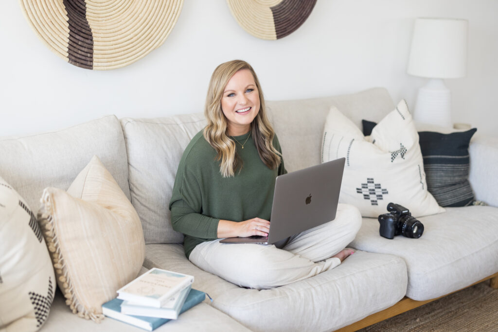
Your Brand Colors in Action (Even If You Don’t Wear Them 24/7)
*Want to learn how to choose the best outfits for your brand photoshoot? This blog post has my tips!*
Here’s something important to remember: you don’t need to wear your brand colors in every photo for them to make an impact.
You can absolutely wear muted neutrals in your brand session — like creams, grays, or earthy tones — and still have a bold, energetic brand by letting those brighter colors show up elsewhere.
For example:
- A coffee mug in your brand color
- A bouquet of fresh flowers that match your palette
- A notebook, throw pillow, or backdrop accent in your bolder tones
These subtle details create visual consistency and help your brand colors come through — without needing to wear them head-to-toe.
And even if your brand colors aren’t something you wear often, you’ll probably start to notice that you do feel a natural connection to them.
Once you’ve chosen them intentionally, you might catch yourself noticing those tones in your home decor, your favorite coffee shop, or the little things you’re drawn to in everyday life.
That’s not a coincidence — it’s alignment.
You don’t need to force your brand colors into your wardrobe. Just allow them to show up in the ways that feel most you.
P.S. Want to learn more about how to seamlessly incorporate your brand colors into your brand photoshoot? Check out this blog post!
A Simple Color Psychology Guide to Get You Started
Here’s a quick look at what some common colors tend to communicate:
- Blue → Trust, calm, professionalism
- Green → Balance, growth, peace
- Yellow → Optimism, happiness, creativity
- Red → Passion, confidence, energy
- Pink → Softness, compassion, femininity
- Purple → Creativity, luxury, wisdom
- Black/Charcoal → Elegance, sophistication, boldness
- White/Creams → Clarity, minimalism, spaciousness
- Earth tones → Warmth, groundedness, natural
Keep in mind — it’s not about picking the “right” color from a list. It’s about choosing the color(s) that feel aligned with the transformation you create for your clients.
Your Brand (+ Brand Colors) Will Evolve — and That’s a Good Thing
There’s no one-size-fits-all answer when it comes to branding.
You’re allowed to evolve. Your visuals and brand colors should, too.
You might shift your color palette down the road — and that’s totally normal.
But the more intentional you can be right now, the more confident you’ll feel showing up in your brand.
Let’s Make Your Brand Photos Feel as Aligned as Your Work
Whether you’re planning a photoshoot or going through a rebrand, I’ll help you bring your vision to life — even if you’re still figuring out your brand colors.
P.S. Does your current brand and website need a little refresh? Let’s give your website and brand a glowup so you’re always attracting dream clients who are willing to pay your premium rates! Contact me using this link to learn more!
📸 Ready to create brand photos that tell the right story?
[Let’s connect and plan your session.]
Book Your Own Brand Photoshoot Experience:
If you’re looking to capture beautiful brand photos that will elevate your business, I’m your girl! As a bay area brand photographer, I travel all over for brand photoshoots (and will even travel all throughout California & abroad!) I work with heart-centered business owners and service providers to capture their unique brand — and I focus on capturing photos that showcase your brand story.

